“Fear The Fin”
The Sharks have embarked on a new and exciting era, under the ownership of MVM Holdings and with the injection of world-class players participating in a new international competition, in a new hemisphere, the time has come to reposition our brand, in our quest for global appeal.
Commenting on the rebrand, The Sharks CEO, Dr Eduard Coetzee said: “Re-igniting the passion for the brand amongst our loyal support base not just in South Africa, but globally is the driving force behind the rebrand as we broaden our reach and attract new markets internationally. The positive changes we have undergone since the global pandemic will be used as a catalyst to successfully reposition our brand as an internationally revered rugby brand that is underpinned by a culture of inclusivity.”
“The golden thread running through this repositioning of the brand is our FANS. We are keeping our loyal fans at the centre of everything we do and we want our fans to be part of this incredible journey and evolution of The Sharks brand.”
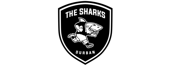
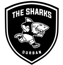
Our much-loved mascot Sharkie has been at the coalface of fan engagement since the 1990s when he emerged as a fun-loving character that embodied The Sharks identity as a family brand. Sharkie remains iconic and whilst we don’t want to fix what is not broken, there was a need to adapt The Sharks logo.
The Sharkie logo has been tweaked slightly and has undergone some refinements while retaining the essence of what Sharkie is all about. The changes include the placement of his dorsal fin higher up his back to make him more menacing and dangerous, much like the team he represents. The placement of his fin brings focus to his ferocity.
We have proudly embraced our roots of being a warrior nation by framing Sharkie within a shield. This symbolises the honour and pride associated with the badge as we carry our heritage as an integral part of the global rugby community. The location of Durban has also been added to the logo, as it creates a sense of a home identity for the team.
Our new slogan “Fear The Fin” was created to ensure it stays within the brand’s theme and portrays us as fierce east coast predators and is meaningful to our fans, who are encouraged to chant this slogan at our matches.
The old logo will still appear on the VURC playing jersey for the 2022/2023 season, due to an eight-month kit production lead time, however the new logo will be debuted on the Cell C Sharks kit for our first foray into the Heineken Champions Cup later this year.
As the new season is upon us, we look forward to our fans globally embracing these new developments and joining us on this journey, as we strive to raise the bar in all spheres of our business.
Our Team. Our Fans. Our City.
Related Posts
« Mosi, Nkosi, Simelane make Vodacom Bulls debuts in Vodacom URC opener Vodacom URC: Gauteng Derby kicks off local action »


